Warm and Cool Whites Explained
How to work out if your colour is warm or cool especially when it comes to whites.
This is one of the biggest questions I get asked when my Interior Design Hat is on.
Here is an Elements at Home personal explanation of the way warm and cool colours are distinguished.
All our paint colours have a RGB (Red, Blue, Green) code.
If you happen to look on the Dulux website as an example you will find a section called the Colour Atlas.
In there you will find all the colours and their individual RGB Values.
This is extremely valuable when deciding which tone of white you would like to choose.
I also believe the warmer colours are more suited to warmer home styles a little more traditional in their appearance or simply on the safer side of white.
Cool colours tend to lend themselves more to the contemporary modern homes.
Now before I go any further lets remember the number 255 and lets pretend this in general terms means pure white. So the closer the numbers get to 255 the whiter they look. Below are some numbers for you to compare to.
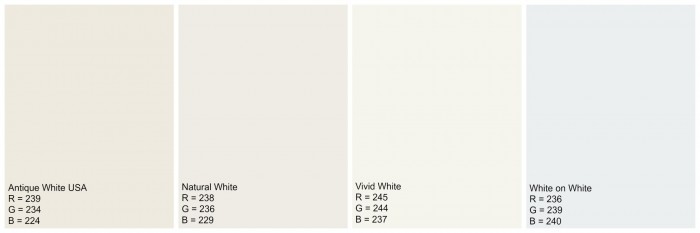
Above I have pictured some of the most commonly used whites in the Dulux Colour range.
With the ideas I have given you already, you can now see how the Red Values (except in the Vivid White) are higher in value with the warmer looking colours and the Blue Values are higher in the cooler colours.
Dulux Whisper White
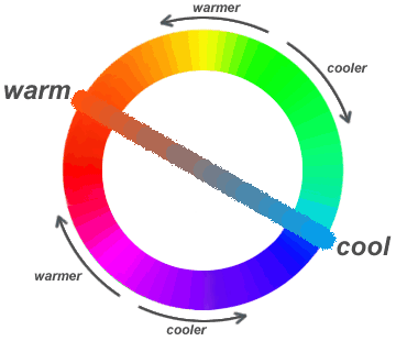
So as you can see via the image below, the colours heading towards red increases the Warmth value and the colours heading to Blue increase the Coolness.
If they were RGB Values
Warmest colour would be: Red = 255 Green = 0 Blue = 0
Coolest would be : Red = 0 Green = 0 Blue = 255
Let’s go back to the image above Antique White has more Red Value so its warmer than White on White which has more Blue value so its Cooler. When you place each of your chosen colours next to each you will really see how one is cooler than another.
Dulux Natural White
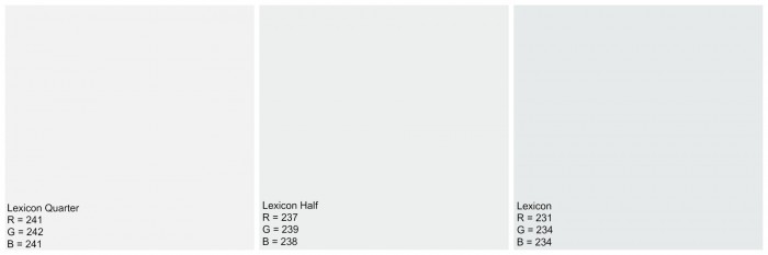
Above I have given you the RGB codes for the same colour but with different strengths. I quite often encourage clients to use the same colour as your walls but in a half or quarter strength for your door frames and skirting’s. As you can see Full strength Lexicon is a cool colour as you halve it you increase all the values to get it closer to white and then again with the quarter strength. Quite often if you want a crisp standard white such as a ceiling colour you could/would use Vivid White for a warm crisp ceiling white or Lexicon quarter for a cool crisp ceiling white.
This is a little more technical but some of you may find this beneficial.
As a guide G or the Green Value takes you through shades of turquoise, green and yellow each adding more warmth. When G is zero you head into the bottom half of the circle and as it heads towards the maximum 255 we jump over the diagonal line.
To all the lovely readers who frequent Elements at Home for their White paint ideas I hope this has helped.
If you have any further questions regarding your white colour options please head over to my
Facebook pageDulux Vivid White


Could you please give me your opinion on an Dulux Natural White bedroom facing north. I have heard a white room is best facing north?
Thanking you.
Thank you so much for this article! I needed it a long time ago but luckily enough I think I have made the right choice and this info it will help me further. I’m new to your site and I’m finding it marvellous so thanks again for all the info., and great solutions.
This post was really helpful – thanks!
Hi – Thanks for this info, Ive been grappling with what to do in our place. Could you explain what happens to the colour as you go from full strength to 1/2 to 1/4, does it become cooler?
Id like to use whisper white as we are going for a more traditional look, but our living areas are full of natural light, and would like a cooler shade, but tiles in the kitchen appear to be on the warm side, hope you can help
Thankyou so much for this it is really helping me to understand my whites. I would love to know your opinion on the best white for a modern homestead with blackbut australiana grade flooring and plenty of natural light. I am thinking more along the lines of whisper white or natural white but very undecided. I was just going traditional ceiling white with ceiling and trims. I am a person that tends more towards the coolness but don’t want the house to feel sterile. Thanks again
Thanks so much! I found this article really helpful.
Hi There,
Trying to get right white paint for outside, antique white and natural white too creamy. I think I have white on white at the moment. Would whisper white be slightly milkier?
Thanks Nicole
Hi everyone, please see the top of my page……click on the hire me drop down box, you will see there I have $10 design questions available to you. I love being able to help everyone with their white paint questions and this gives everyone my attention. As soon as your payment has arrived I will contact you with a time frame to answer. Usually within 24-48 hours I will be in touch with you and supply you with your answer.
Thanks so much for visiting Elements at Home.
x Kristie
Help , I have made a dreadful mistake. The house is 1920’s with high ceilings . I just painted all woodwork walls and ceiling s whisper white . It is depressing. I can not afford a whole new paint job, how can I warm the rooms? I was thinking of re painting the ceilings with a white white or the walks in a contrast.. Your thoughts would be appreciated