

How to Choose your White Paint
I posted this article recently and it was so successful with all of you I thought I would make sure everyone gets to read it.
I have also a follow up post to write regarding how to look for your paint colours undertones when you find the right colour. But for now this should help you understand where to start.
Please leave a comment if you found this of any help or if you need any more information.
Trying to Choose the right White, it is one of the hardest decisions you will make.
There are so many to choose from and deciding which white will be right is time consuming in every way.
I am going to give you some ways to find yourself the best white and feel confident choosing.

One of the best tips I have is to first know your undertone.
I am not trying to lose you here but seriously undertone is the key.
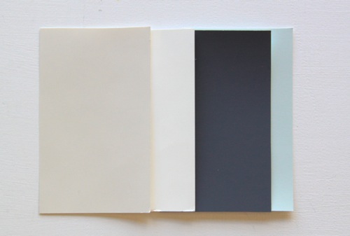
Let me clarify further, there are cool or warm whites and these whites have undertones to create the feeling of cool or warm….

So a Cool White has a grey, blue, blue pink or hint of black undertone to create the cool feeling and
Warm Whites have a red or yellow base.
I am thinking by looking at the 2 side by side above you can really tell which is cool and which is warm.
Cool whites give a feeling if timelessness and work well in areas full of natural light. If you are using a cool white make sure your room has plenty of sunlight and warmth.
A Cool White is perfect for open plan kitchen dining lounge zones. It suits a contemporary space and gives a feeling of cleanliness and serenity

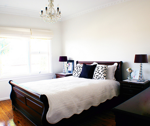
Warm whites help rooms that do not have much light by making them feel warm and intimate, they are easy to look at it and create a relaxing cosy feel. They suit a smaller room, bedroom or sitting room and fit well with reds, oranges, yellow greens and warm browns.
Am I helping yet?
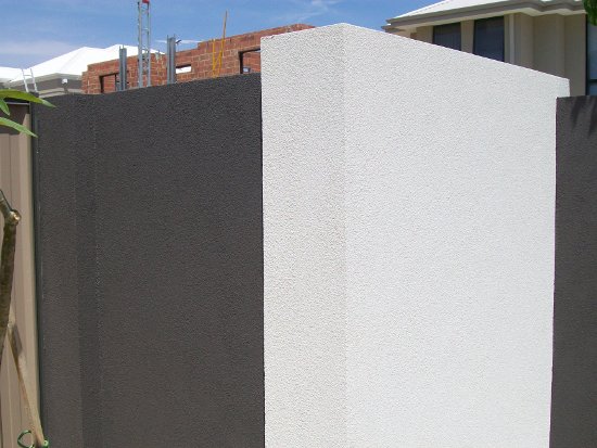
As an idea here are some Cool Whites in a few different brands see if you can see any blue, grey, black undertones.
Cool Whites
Wattyl Winter sky, a blue undertone in different areas.
From Mrs A in the Cove

Murobond Smart White, you can see the benches in the background have a grey look to them
Dulux Vivid White an ever so slight black undertone
Dulux White on White

Lexicon-Quarter Strength. A blue/grey undertone
Solver Parchment half strength
this is probably the best example to spot the blue pink undertone that sometimes comes through in Cool Colours
For me the Vivid White, White on White and Solver Parchment are personal favourites.
Remember the warm whites below have a red or yellow base
Warm whites

Antique White

Whisper White
China White and White Watsonia are the 1st two colours in the sequence.
You can see the red and yellow undertones straight away. But they are both warm whites.
This is white watsonia as and exterior colour
This is China White

Murobond Natural White
Has a pink/grey undertone
Solver Smoke Pearl
I think the best way for you to find your undertones is to grab your paint chips and hold them next to each other or ask your paint specialist if they can tell you if the colour you are choosing is a warm white or cool white.
If you have a dulux paint in mind and are wondering if its warm or cool comment below and I will let you know.
If you have any other white questions you can press the $10 design question button and I will help within a week.
Some of these images were saved on my PC and I had now source with them. If I have not credited you and they are yours please let me know and I will amend this straight away.
It is really hard to choose the perfect white color of your room or on our houses. Thanks for sharing this to us.
Find out more: Arizona Painting Company
This is a brilliant explanation. You have explained and showed the differences so clearly. Well done lovely:)
A wonderful post which clearly explains the undertones. I love the Resene Whites and recently used One Eighth Tea. It goes brilliantly with the cool white lighting and forest reds timber floors. It is very calming colour.
Very clear explanation, particularly with the well chosen pictures to illustrate! x KL
What about whites with green undertones? Are they cool or warm? I am looking at Grand Piano in 1/2 and 1/4 strength. Thanks
Hi there Generally speaking Whites with Green undertones are warm as they fall under the yellow green whites.
So the Red Green Brown mix for Grand Piano is
R G B LRV
GRAND PIANO 216 207 189 66
GRAND PIANO HALF 226 219 204 74
GRAND PIANO QUARTER 234 228 216 80
You can compare this to Hog Bristle seeing as its probably the most visually popular colour.
HOG BRISTLE 220 208 187 67
HOG BRISTLE HALF 229 220 203 75
HOG BRISTLE QUARTER 236 229 215 81
As you can see these colours are really close in their mix…..so I would be confident that it is considered a warm white.
I hope this helps…..please come back and let me know.
Thank you for your help. I like the Grand Piano 1/4 as it is a bit more of a ‘putty’ colour than Hogs Bristle. I am painting a vast light filled interior that has high ceilings and ocean views and I have seen so many modern homes with stark white clinical interiors but I think it will be too bright for this house. It needs some warmth. Thanks again!
Hi,
Thank you for your article. I’ve been trying to pick my white and have narrowed it down thanks to your ariticle. This is a great article along with your love of brass highlights in the home which you mention in a separate article.
We have a big & beautiful 1980s home but some terrible renovations have been done by the previous owners. Luckily they are mostly cosmetic which we can fix without too much drama.
We want to refresh the home without losing the appeal of the original brass fittings, jarrah skirtings, doors and cupboards. There are recently installed bamboo floors which we can’t afford to replace at the moment so assume they are staying. We also have several pieces of jarrah and marri furniture that we intend to keep.
Can you suggest a suitable white for us? This will be used throughout most of the house.
Thank you.
Sophie
Sophie I have just realised my reply never got posted here. Can you tell me did you end up choosing a white? I am still happy to help if you have not.
Hi there,
Please help! I have a family room which is quite dark due to north facing windows (current feature wall) being shaded by lovely green and reddy/purple front garden trees. We are looking to repaint as the current colours in there are a grey/green white (not sure of name as we don’t have any tins to confirm) and a dark grey feature wall (also not sure of name – no tins). I don’t mind the colours, however, we have now decided to change the window converings to a neutral roller blind and to change our current feature wall to the tv wall (east facing). So we thought we may as well freshen the whole room up by repainting with different colours (?) 15 sample pots later (of both whites and feature colours)I am now more confused than ever. First choice of feature colour was the colourbond Paperbark with Antique White (this white feels too white and feature colour too light – no real impact). Now leaning on the feature colour Domain by Dulux (I know, complete turnaroound!)but unsure on which white to choose – Dulux match it with Hogs Bristle but I can’t help feel it’s a little too pink. Then I tried the Ecru and feel it’s now a little to green/yellow – help! I love the look of the picture example you used for the Antique White look but this I feel would be too white for this room, considering it’s a family room with 2 boys both 4 & 5 years old (need I say more?). Which white with Domain or should I be looking at a more dramatic feature wall colour altogether?? confused to say the least….
I am not sure if my reply ever came up for you and I am just looking back through but I am wondering how you have gone with your paint dilemma. If you have any questions still please email me at stylish interiors@iinet.net.au
Thanks Kristie
Hi Kristie,
Thank you so much for your blog, it is very well presented!
I have to reprint my kitchen and am hoping you will be able to help me with this problem… The kitchen benches and cupboard are made of warm wood and the old tiles on the wall are similar to grand piano 1/4 but with a touch of pink in it. I would like to find a white that would match the tile and the wood. I found grand piano would look great with the wooden bench but not with the tile.. It is currently Americain white.. Could you please give me some direction, I am desperate!
Karine
Hi Karine
Can you please send me a photo of the tile and bench top and I will have a look for you.
Kristie
Hi.
I am trying to choose a white paint for my bedroom walls. I have jarrah skirting boards and door frames also a dark wood bedroom suite. The doors in the bedroom are painted an antique white but I want the walls lighter.
I want a fresh modern look but with warmth. Hope you can help me.
Diane
Hi Diane, would you consider doing a half or quarter percent lighter of Antique white? That is a great way of keeping your paint uniform and make your accessories colour the hero. Good luck. Kristie
Hi
I’m doing dulux hog bristle half on all walls. My home is small and it is NOT open plan design. What could you suggest for my skirting,door frames and doors? I was thinking Fair Bianca. What do you think
Thanks
Hi there, I always use a percentage of the wall colour. I would use a quarter of Hogs Bristle. I don’t think there is a need to introduce another paint colour. Because you have mentioned its not open plan you need to keep it simple and create colour and personality with your accessories instead. Thanks for stopping by. Kristie
Thank you so much for replying. Great info.
Hi Kristie,
Great article and well thought replies on the posts. My house is same (small and no open plan). For the above scheme, should I go for full gloss or semi gloss Hog Bristle quarter on skrting/windows/doors? Thanks, Jig
Hi, very helpful post, hope you can help me here, can u you suggest a wall colour that would suit kitchen/dinning area that has little direct natural light. Our floors are bamboo ( in the natural honey colour). White marble look splashback and counter top. Antique white cupboards ( has a pinkish undertone) have I got too much difference tones as it is? :s I can’t change any of the above colours but to repaint the walls. Help!! Thank you.
Hi there, you can ask for your Antique white at the Dulux shop and request less red to be added (They operate on formulas and percentages of colours) to make up your colour. By asking for less pink you will get more of a white to blend with your marble but still keep tonal with your cupboard doors. Get a sample pot first with the new formula sticker on the side (so you can request the same coded colour when you go back in). The other option If you wall colour is not meeting up with your doors or splash back and there is a good space between them you can look at something like Dulux Whisper White. I hope this helps.
Thanks so much for your advice. My cupboards are by polytec and have been told their antique white differ to dulux antique white. If I went to the paint shop with a sample of the cupboard colour can they visually match it up? Also could I just go to bunnings for that or should I go somewhere that specializes in paint?
Oh ok I see, yes Antique White cabinets are different in colour to Dulux Antique White, sorry I thought you meant you had painted cabinet doors.
Ok, so yes if you take a door to the paint shop, Dulux, Solver, Inspirations you should be able to get a match. I have used Bunnings in the past myself but I have heard their machines can sometimes be quite out when it comes to colour matching.
The other thing i wanted to mention is before going to those lengths, go to the Polytec website and order a sample of Antique White (should be free and smaller than a whole door) and only a couple of days and then get a sample pot made up in the colour matched paint to brush on your wall. If you feel its adding to the pink get them to do one more sample pot up the same but a half strength lighter than what you have. With all of this in mind I would go to a Dulux centre. They are very competent, very knowledgeable and usually very happy to help. Once you are happy with your sample pots then you know you have a code to work with maybe take it to a Solver or Bunnings store get a sample pot from them and make sure its the same before ordering big tins of the colour. Dulux paint is very good but the other stores are sometimes cheaper.
Thanks. You are very helpful. I will do as you suggest and take a sample to dulux.
Hi Kristie, I have a small open plan apartment which has floor to ceiling windows that over gardens. Can you please suggest a paint color that you think would be best to make the apartment look bigger and if I should paint it all the one color. Many thanks Sarah.
Hi Sarah, Absolutely, doing one colour is a great way to create a feeling of space……even door frames and skirting boards in the same colour but a quarter strength and gloss of your chosen colour will help. Taubmans Crisp White is really good for this. A great natural white, it doesn’t throw too much pink or yellow and so with all the natural light you have it should just be a great back drop. Without knowing your plan I would also say add in some greenery. If you are overlooking gardens by bringing them inside a little it will make it feel like your indoors and outdoors are linked. This will also create a feeling of space. Add bright colours in small doses for personality. Good luck.
Thank you for your blog, all comments are interesting to read. I have a traditional 1930s weatherboard te home with poor lighting. We have a loft style extension for our bedroom upstairs (with exposed beams similar to some of your pictures above) and am hoping to lighten the room. We have previously painted our hall and front rooms downstairs in cool whites with lexicon quater skirts. As much as I like cool whites I feel this has now been a mistake due to the lack of light it seems quiet dull. What warm white would you suggest for a loft bedroom with poor light and should I carry the lexicon upstairs forI wardrobe doors/shirts/windows or is it a mistake to pair warm walls with cool trims?? I imagine I should just use a half or quater strength of the wall colour. Also, the bedroom walls have wood panelling half way up so should the panelling,walls and roof be the one colour? Should the panelling have any gloss like the skirts?? Sorry for so many questions and thanks in advance for your help! Rebekah
Hi Rebekah, thanks for your compliment about my blog its great to know I am helping people. So Upstairs is Quite dark which is why you may not only need a nice warm paint but also a feature colour could work nicely to co ordinate. How about a colour like Dulux Buff it. Its more of a light Taupe beige. Keep your skirts and frames the same but maybe look at doing them the same colour as your ceiling in that loft room to frame the room. Yes I love using a percentage of the wall colour as the skirting and frames as it keeps the flow and look simple and clean and makes way for people to use colour in other ways effectively. If you want to blend the panelling make it the same colour as your walls. ceilings should be the same of similar to your skirts for this room or keep it as a ceiling white. If you want to make a feature of it do it in a full percentage and the walls in a half percent. Gloss will look nice and bounce the light of it a little for effect. Consider the look you are going for first though. I hope some of this has helped.
Thanks Kristie. I’m having trouble getting Taubmans paint. Is Dulux white on white similar? Or is there another Dulux paint that you would recommend? Thanks Sarah
Sorry for the delay Sarah, White on White will be slightly warmer than the crisp white but still perfect with the idea that you will keep the other trims in the same vein.
Hi Kristie, I want to paint my room white, however I don’t want a feature wall, as I would like to change the theme of my room often through accessories. My bedroom gets quite a lot of natural light, as it has 3 windows and is at the front of the house, however it is quite small (not the master bedroom) I was leaning towards whisper white, what are your thoughts? I have dark chocolate furniture.
Thanks in advance! Corinne
Hi, can you please advise what wall color is used in the photo in your article showing warm color for stairs with large pendant lights (4th photo in this article.
Hi there, I cant find exactly what colour has been used but this is the link to the Architect that Designed the home. http://www.sb-architects.com/#/portfolio/single-family_residential/the_hillside_house I can also tell you the interior design was by Erin Martin and some people have mentioned that Benjamin Moore’s Vanilla Ice Cream may be similar or possibly the same.
Hello
I’ve found your article really interesting.
I was thinking about painting some walls in Dulux Grainger, and was wondering if you thought Antique White USA was the right white for the roof and trim? Otherwise maybe Vivid White?
What do you think?
Thank you in advance for any help you can offer!
A few thoughts. I love Grainger as a colour. Pairing it with Antique White will showcase the creamier side of the white. With that in mind Vivid white would be a better match but it will keep a very cool look for the room. Depending on what your over all feel is I would stick to something like Natural White which sits in between those 2 colours you have mentioned. Not to cool and not to warm. Grainger can throw a little bit of purple if you go to warm. If you have a lot of browns around this colour will really look purple. Otherwise light colours will keep it looking grey. I would love to see a photo when its done.
Hello
Thank you very much for your quick and thoughtful reply. It’s helped a lot.
I had been thinking Antique White as I wanted the rooms to be warm and inviting, and I was worried the cool whites on the shades of grey may seem to stark, but then I was concerned with the warm white seeming too murky and dull, rather than the crisp, bright look I was hoping for. Does this make sense?
I go for blues, greys, and purples, rather than browns, beiges, reds or other similar colours.
It seems like a white in the middle would be ideal, I just didn’t know what that would be.
Thank you so much again for your help.
I’ll be off to grab a sample pot of Natural white. I’ll definitely send you some photos, but there may be some more questions beforehand!!
Kindest regards,
Claire
Is dulux white on white cool or warm?
Would dulux ceiling white be brighter than my walls being white on white?
Hi So sorry about the delay. I am now taking all questions over on Facebook but I am trying to get back over to these questions also.
White on White is a cool white and ceiling white is generally Vivid white which is sometimes marginally warmer. Not probably noticeable but you could always do the same colour for your ceiling.
Hi ,
I would like to get your opinion with regard to colour selection for my living area, i have lexicon quarter on the walls, ceiling white on ceiling and was wondering if it is a reasonable choice to choose white gloss ( same shade as ceiling white ) for my skirting and white for wood work . Thank you
I would consider doing the Lexicon quarter for your skirts and frames also but yes the gloss will lighten them up and make them appear slightly lighter than your walls. Your ceiling white may not be the same tone as Lexicon which is why it may not work but check the 2 on a sample board first.
Hi, just wondering if you can help – we have a big open plan living/dining/kitchen area that we are currently renovating. It is a very dark area and we need our lights on nearly all day, with that in mind, I was going for the cool whites as I thought this would lighten the room more than warm whites. I really wanted a crisp white rather than a cream white but after reading your post I am not sure whether a cool white (ceiling white and lexicon half for walls) would be the right colour? We have jarrah floorboards, beige couches and white window coverings (blinds). Our painter has recommended whisper white but I thought it looked too cream?
I think Dulux Whisper White is a good choice to compliment your existing Jarrah. Unfortunately the lack of sun light will not change even with a lighter white paint colour and you will still need to have your lights on ( I know because its sounds just like my open Kitchen/dining/living) Keep the colours the similar for the whole area and maybe use your lighting to create different zones instead of your paint. Bright white lights for your kitchen and pendants for dining and then downlights and lamps for your living.
Good Luck
Kristie
Hi, have learned lots from this info, but still need a little direction. I like the idea of doing white but a little hesitant. In a townhouse and have just renewed kitchen cupboards/doors in Antique White & have granite benchtops in mottled brown/ gold tones. Would like a warm white and have thought about doing Antique white on walls as well(or any suggestions) would also like to paint architraves ,not sure whether to do darker or lighter than walls but leave timber window frames as they are. Also have Blackbutt timber flooring.H
Blackbutt flooring…..Gorgeous. Antique White sounds great as does Natural White as an option. I always suggest lighter for your Architraves unless your going for a specific “look”. This can be best achieved by doing a gloss version of your wall colour and a half or quarter shade lighter. In smaller spaces I like to keep the colours to a minimum rather than adding in too many. Please get a sample pot and paint a couple of patches near your cabinetry before absolutely deciding though.
Ciao
Kristie
Hello – I need to choose an interior white for an open plan kitchen and living space with blackbutt floors – we were going to use Dulux Vivid White for ceilings and kitchen cabinets but there is not an abundance of natural light in the space so we were thinking of Dulux Natural White for the walls – is it a cool or warm white? Thanks so much.
Natural White is a great mix as it has an adaptive quality to work with cool and warm colours. It is more of a Warm colour as far the amount of Red it has in answer to your question though. Maybe you could consider Lexicon as your wall colour.
I am considering painting my kitchen/family/dinning area. At present the walls are painted Divinity and are too creamy for what Im after, the area is quite large and has a white kitchen and I have lots of red cushions and throws with cane dining chairs and red stools. Im after a warm white but also something that is fresh and vibrant along with homely.
What do you think?
Hi there, I am not sure about the colour divinity so its hard for me to compare but Dulux Natural White might be a colour that suits what your looking for.
Sorry for the Delay.
Kristie
I love the dulux white on white photo that shows a feature wall. Almost duck egg green…. Would u know what cour was used.. I have chosen a Dulux natural white throughout well lit home .. Previously whisper white but felt it needs to be whiter… Tv room has timber floors and I like duck egg blue but it was too blue.. 1/4 strength may work but now that I have seen the feature wall photo – I love the tone .. Appreciate help..
Or if u know a pale duck egg similar to Laura Ashley .. Not sold in Australia..
Please help me too; I am getting my recently rendered exterior walls, and we want white color (Dulux Whisper White) with a couple of feature walls (entrance, and exit to the back garden) in blue (Dulux Equanimity). We were thinking gutters/fascia/sofits/gable also in white (Dulux Withe on White). Would you agree on these colors match?
Hi Semra, Sorry for the delay. I have had quite a few questions to get to and tackling them one at a time.
White on White will work but also consider Vivid White as an option. I always suggest a sample pot before committing to any colour…Just to be sure.
Good luck
I have a beige colour lounge suite, but I dont want a warm white room. Will cool white walls go with it?
Hi Everyone, I have about 30 questions to answer currently regarding your white paint ideas. Please know I will get to you but they are taking time to consider everyones paint requests.
Thanks so much
Kristie
Hi White advisor extraordinaire,
Which white for interior walls, ceiling, architraves, skirtings for – very small house with very small rooms, narrow cypress pine floor boards and loads of sunshine all year round. We have 60’s 70’s light amber coloured wooden furniture and furnishings in brown velvet, black leather and red/orange/green accessories. House is empty now we move in 21st August
So sorry for the late reply I hope your move is going well. I wanted to suggest Antique White USA and being small keep your architraves and skirts in a half strength gloss version of this colour. Ceiling Vivid White.
Hi Kristie,
I have a very open plan kitchen and living area, the living area has cathedral ceilings and the kitchen area just your common ceilings, I get plenty of natural light in Summer through large windows throughout, but currently live in a cold area and it is a dreary grey green colour similar to colourbond’s Surfmist colour at the moment and rather depressing. I am looking for a white to paint the entirety of the houses interior, but I am stuck as to whether a warm or cold white will suite best ( as previously mentioned it is rather gloomy and cold in winter). All my furniture and décor is neutrals- greys, whites, creams, chocolates and maple and pine timber, with light cream pine floorboards in living area and chocolate carpet in bedroom areas, although the bathroom floor is tiled a cobolt blue with the same blue colour accent tiles as splashback in the kitchen, the previous owners pretty much made a giant mess of a colour scheme. I am really looking for one white that will suite the entire house and any help would really be appreciated as I am struggling! Thanks Kate
Hi
My partner and I have just bought our first home. The walls, ceilings, skirts etc all need to bee paintined. It is a dark house, (we plan to put a couple of skylights in) with lovely wooden floors, so I am keeeen to paint the ceilings and skirts in a clean white and the walls in a warmer shade of white, would this combo work? Hubby wants to usee a white tinged with green for thee walls and plain white for the ceilings and skits. Also the kitchen cupboards are in good condition and in a larger kitchen I wouldn’t change them, but given how dark the kitchen is I thought a coat of antique white would bring light into that area. Do you think we will spoil our timber cupboards if we do so? Perhaps once the walls etc are painted the cupboards will make a nice contrast. I have photos but don’t know how to attach them. Thanks for the info you have supplied in this post.
hi there:) we have just purchased a new home it has lovely warm floorboards but has a dark charcoal grey kitchen and I am looking for a base colour to do throughout. am thinking possibly a white with a pink/grey undertone as I would like to do a few feature walls through the house in warmer colours. please help! also some ideas for feature wall colours would be much appreciated:)
Nice post and Let us show you how to utilise the fall either up or down, side to side on your land to it’s full potential. Our designers look at the best orientation of our homes for energy efficiency, personal lifestyle requirements and of course your budget.
Hi there our doors ceilings are painted Dulux Clarks Beach I am guessing is a warm white. Currently our walls are Dulux Dunsandal but its too dark any suggestions on a lighter colour that would go with the Clarks Beach?
Hi Kristie,
Thanks for all your white paint tips, they have been very helpful so far :) My partner and I recently bought a house (built in late 80’s) and we are having difficulty choosing the right paint colour for our walls in the main living areas. The house has black slate floors in the hallway, dining, kitchen and 2nd living area, the house doesn’t get a lot of natural light but the rooms are quite spacious. So far we were thinking Dulux Vivid White or Taubmans Crisp White for the trims with some kind of warmer white for the walls? can you recommend a Taubmans and Dulux wall colour to compliment? or any other suggestions?
Thank you, Cassie
Hi Cassie, how about Dulux VIvid White trims like you mentioned with Buff it quarter for some warmth. Let me know how you go.
I am building with McDonald Jones (Sierra) and we can only choose Taubmans paint…. We are after a cool white to match our kitchen cabinets which will be in Polar White. Can you help me choose a white?
Hi there, I think Crisp White sounds like a colour that will suit your needs.
Thank you for responding! As Crisp White has ochre in it, I’m worried it will throw yellow tones…
We have decided on Taubmans ‘Big White’ for the walls and Taubmans ‘White Illusion’ for the ceiling & trims…
This is really great you have let me know, I am going to check these colours out myself together. Polar White has a grey black undertone so as long as you have the same feel in your paint it should work.
Hi, I’m hoping you maybe able to help. I live by the ocean and have recently painted our sitting room hog bristle quarter and I’m a little disappointed as the room faces north and the colour looks yellow? We painted the back rooms facing south and they look like a beautiful soft beige pink tinge? I can’t change he colour now but I’m about to paint my bedroom which facing north and I’m think of Dulux Natural White. The bedroom is a lovely light filled room. Would the Natural White make it too bright.
Natural White is a great colour but can yellow a little bit in certain light, you could also look at White on White or Buff it Quarter may get that same look as your hog bristle that you do like. Let me know how you get on. :-)
Hi, I wondering if you could give me your opinion on a hog bristle quarter painted room with bursa beige marble tiles and a red lounge suite. Do I have a problem? Help please.
From what I can tell Bursa Beige has a pinky tone? I am pretty sure hog bristle quarter will work and then your red sofa will add more pink too the walls. It may be very pinkish by the end but that may be what you were hoping for I would add some more off white and grey to help break it up….thanks for stopping by.
Hi there. What a great blog. Wondering if you can help. We currently have our walls painted in Hog’s Bristle half strength with Antique white architraves and skirts. We like it in our North facing living area that gets an abundance of natural light but we’re not as keen downstairs in our West facing rumpus that only get’s the afternoon sun. The ‘Hog’s’ looks a bit washed out and dirty. Could you recommend a paint for downstairs that would help tie the two together? Many thanks
Hi I am thinking you may benefit from looking at Buff It half or even quarter in Dulux. You could even look at Hogs quarter too keep the colour consistency but lighten it off a bit. Thanks for the compliment and let me know how you get on. :-)
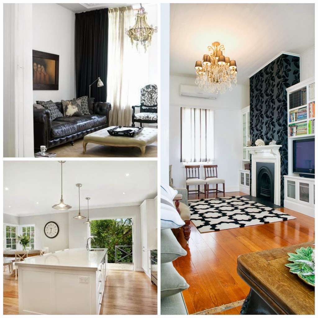
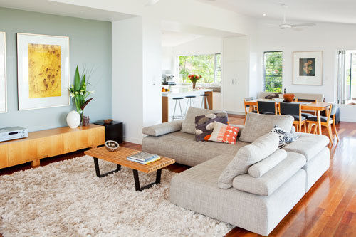
I can definitely see how the undertone can influence the feeling of a room. I really love the colour scheme used in picture 4 of the staircase, I think it looks great. I also like the kitchen design and colour scheme, it looks modern with clean lines and utilises the space really well.
Hi Kristie, thank you for your reply. We acquired the Red lounge suite after we painted. :(The room faces north and gets heaps of natural sunlight
the HogBristle Quarter looks a little yellow to me? Do you think it can still work?
I think it will be quite light if you have alot of natural sunlight but you could also look at Dulux Natural White its a more taupe version of the same depth of colour. It may throw more of a pink than a yellow with the colour of the sofa bouncing off the walls but you should be fine.
Have been looking for advice regarding painting with whites and was none the wiser until I read your article, it makes it all so much clearer. We have just added on a sunroom to the side of our house(but not all glass) with three big windows, big class french doors and one skylight, so we should a fair amount of light. My husband wants it all white but I fear the plain brilliant white on both ceiling and walls as being too much. Our new room is like your first picture with high vaulted ceiling with two beams.
Now, at least, after reading your article, I think it is a cool white we will be using on the ceiling and we are thinking grey, green, purple colours in cushions and throws afterwards. I feel the walls should be a different colour than ceiling? I like Dulux but I cannot find your White on White. Please suggest a colour scheme for me. Do you think a light grey on the lower walls would be cold?
I think with that much light you maybe able to handle a slight colour addition, maybe consider Natural White or Whisper White.
Let me know how you get on. White on White is great but very very light and throws blue sometimes.
Hi Kristie,
We are going for a scandi/danish kind of look, so our feature weatherboard wall in the dining/lounge area and one wall of the bathroom is going to be dulux monument which is a dark charcoal colour and the rest of the house (walls and ceiling) are going to be the same colour white. We also have the orange/blonde floorboards which I want to redo to a more grey whitewash kind of colour eventually too. Think white, grey & black tones with splashes of timber and a few green plants. Will add some pretty pastel/soft colours with wall prints and furnishing also. I think you get the picture? :)
What colour white do you think we should go with? So far I am thinking possibly Dulux vivid white, white on white, lexicon quarter strength or murobond smart white. I am also been recommended Resene blackwhite, seafog and double alabaster.
Thanks
Sherry
https://www.facebook.com/mayandbelle
http://www.mayandbelle.com.au/
I may have missed you but I think Vivid White or Whisper White if you want a slightly warmer white. White on White and lexicon throw alot of blue but that could also suit your styling in a more Modern Scandi feel. I hope this finds you well and you have been successful in your paint venture if you have already started. Now I am off to find you on Facebook. ;-)
Hi there. My husband and I are renovating upstairs in an old Victorian pub into a bar/casual dining/function space. Lots of natural light and high ceilings. Floors will be stained 50/50 black/walnut baltics and we want to use white light fittings on walls and ceiling if possible. The bar will be antiqued copper with an iron bark top and tables will be iron bark. We will have some black leather sofas with walnut legs. We were thinking natural white on walls and trims but someone said it can turn grey in shadow and suggested antique white USA. We are worried that might be too creamy with white light fittings. Would love to know what you would suggest. Many thanks!
Hi there I actually really love Natural White and dont see it being too grey at all….I must say everyone sees colours very differently….like they say “in the minds eye” maybe what you have in your space…black sofas, dark floors and copper may be what makes your colour reflect some greys. Your main furniture pieces always bounce colour off your walls. You could also look at Sandy Day half or keep with your Natural White.
I love your blog and visuals it is so inspiring, I especially like the picture with the raked ceilings and beams. I would like to paint our relatively newly built cottage in the county white, it have raked ceilings in the open plan living area and main bedroom. I have a painting drama, after painting the bedroom Dulux White on White on the weekend it appears blue. I should have listened to my husbands choice of Vivid White, do you have any suggestions? Shae
Without saying your Hubby may have been right, I think that may have been the better option. Considering you want something very light this really is the best option. Let me know if you have further considerations.
I love Vivid White it is perfect! I would like the doors and trim the same colour but do you think semi gloss, gloss, water or oil based? Shae
Hi, I agree, this IS a great blog. We are painting the interior of our home and I was thinking of using Hog Bristle Quarter on the walls and Lexicon Quarter for the doors/architraves and skirting as well as the ceiling. After reading your blog I realised I have chosen a warm colour for the walls and a cool colour for the ceiling and trim. The house is very large, waterfront and very bright and sunny so we don’t want anything too white. Do you think these colours will work together or do you have any suggestions? Thank you.
Hi there I love Hog Bristle Quarter and think that will work really well and maybe pair it with Vivid White instead of Lexicon Quarter….as I mentioned regarding the RGB Values previously. Vivid White has more red and Lexicon has alot more blue which is why the Vivid White will appear warmer than the Lexicon. I hope this helps.
Hi. I am planning to paint my recently bought apartment. The living room is the only area that gets ample natural light. The bedrooms need to brighten up a bit. I am thinking of painting the feature wall of my living room with citrus Green paint like Golden Passionfruit (Dulux). I would prefer to paint re st of the apartment with a shade of white. I need white that will go with Green in living area and brighten up other parts of home. I am planning to use white lights in the house. Any suggestions? Thanks
YOu could look at White on White as a crisp vibrant white. This has alot of blue/green in it so will bounce the citrus green really well.If you want to warm to the citrus you could look at Vivid White or Natural White. Let me know if this helps or works out for you. Please reply over on my Facebook page if you like.
Hello,
I was looking to paint my walls in antique white usa but found it way too yellow. I’m loving my sample of White on White – what colour should I do on ceiling and trims? I have bamboo/brown floors.
Hi I would consider, Lexicon half or quarter strength as your trim colour. If you have a small room or space you could paint the White on White as your trims but use a gloss enamel which reflects light better. Your floors will simply become the backdrop to your walls and your addition of rugs and soft furnishings will help keep the colour flowing.
Hi Kristie, I have just painted the modern north facing part my renovated Cal Bungalow in Lexicon Quarter. I’m a little worried though if I do the south facing (with not a lot of light) main bedroom, living room and entry the only parts of the old house remaining in Lexicon it will be too cool. I was thinking of painting those rooms in a slightly warmer colour like Whisper White or Natural White. I’d really appreciate your help. Many thanks
I would consider Natural White to help you get some warmth its in the same group of whites as Lexicon so you should be ok. It will only be you that knows or notices that its slightly different. I am thinking with a Cal Bung you have warm timber floors so that will add warmth anyway. Thanks for visiting and let me know how you go.
Hi, we are in the process of selecting our internal color paints and we are confused which one to get… We have the CRISP White in Taubmans Paint for our architraves and all other woodworks.. we are thinking if we just use Crisp white as well for all internal paints along with our Lexicon quarter dulux for our kitchen, would that look good? Or south pole from taubmans for our internal walls instead of crisp white? We want to have a white a nice and fresh on the inside. Hope you can help us. Appreciate any help.
South Pole has a little more depth so I would consider the crisp white as your addition. I do not have a sample of Crisp White at the moment to compare with Lexicon Quarter but I am also not sure if you mean your kitchen is going to be painted Lexcicon Quarter Doors? or the wall or trims. Lexicon quarter is a grey/blue or cool looking white and crsip white may be a touch warmer. I would need to get a sample pot of crisp white before saying for sure. If you happen to have the colours and can post images on my Facebook page please do, that may help me help you further. Sorry I couldnt enlighten you any further just now….
Hi Kristie, thanks for your brilliant article. I have been attempting to find the “perfect” white for sometime and I am still experiencing major difficulty. I am attempting to paint my home office to give it a warm but professional look. My main problem is I have primrose (cream) windows. They can’t be changed or painted. I have cream toned plain curtains.I have painted another room in a shade of white which looks beautiful but clashes horribly with the window frames – they now stand out, glowing yellow against the lovely white. Grhhh. Obviously I have picked the wrong white. I then painted another room Dulux 1/4 Shell Haven which looks great against the windows but is too yellow for my liking. Could you suggest a white that might be the perfect medium? I am thinking of a feature wall in Warm Neutral but am not fixed on it if you have a different suggestion. You may be my life saver with this answer as my family is stick of the sample pots piling up!
Hog Bristle Quarter may work really well for you its close to shell white but more of a beige tone. Sometimes you have to let your window frames become a null object to work with. pretend its not there in a way. They are often a necessary evil if you will. Let your curtains be part of the room and not part of your fixtures which is what happens when you focus on these parts of your home. Hog bristle quarter will work well with Warm Neutral also. Thanks Barbara for visiting my blog.
Hi Kristie, thanks so much for the advice – really appreciate your time! Barbara
Hi Kristie, we have Primrose Aluminium window frames and Old Lace windows, skirting, doors and architraves, which is way too much yellow cream.
We have started re-painting the house in 1/4 Hog Bristle which is working quite well, but I would love to change the architraves/doors etc. as well, would whisper white work with Hog Bristle 1/4 on the wall and the primrose window frames? Is there any other colour that may work for architraves/doors? Thanks Donna PS. We have done a feature wall in Warm Neutral and it looks beautiful.
i am currenty looking at painting my whole house smoke pearl with white skirting doors etc but am worried as my carpet bench tops are brown and my tiles are a creamy colour will the smoke pearl look good
The last picture that is smoke pearl was a renovation I did and if you have a look through the arched doorway the furniture is a very dark wenge brown, I am fairly confident the smoke pearl is very adaptable to all the colours you mentioned.
Hello, could you please let me know what are the Dulux paint alternatives for White on White and Vivid White in Ireland or UK? I cannot find the answer anywhere. Many thanks!!!
Hi there, I have contacted Dulux Aus and they have advised me that none of their colours translate to Dulux UK colours but I have left a message on the Dulux UK site and no one has got back to me as yet. From everything I have been looking at their is possibly a colour called Ultra White that may work well for you. I am sorry I can’t help any further as yet.
Hi. We are renovating a 1950’s bungalow in Auckland. There is not a lot of character in the house (other than wooden floors) so looking to modernise it. Using square stopping (e.g. no Scotia). Also looking for a warm white, but not with yellow tinge. Can you make any suggestions? Thanks
I think Dulux Whisper White is going to be your colour of choice. This will add warmth without being to yellow.
Hi
I am trying to decide on paints for my apartment. It is a small art deco apartment that does not get very much natural light. I am planning on ripping up the carpet and getting the floor boards polished. Can you suggest a colour/clours for the walls, skriting boards, doors and ceiling?
Many thanks
Vivid White is great for your skirts and other trims, then you can use a warmer white to work back with the art deco styling like Dulux Buff It Half strength. This is a warmer white with a nice depth to work back with Timber floors. Or if your apartment is on the smaller side choose a colour like Dulux Whisper White everywhere but use it in a gloss enamel for your doors and trims to create an open feeling with not too many stopping points.
Let me know how you go and thanks for visiting Elements at Home
Hi Kristie am looking to re paint house in white. I started with a bedroom using the Dulux Okarito which I now gather is a cool white?? The halls don’t see a lot of sun so now wondering to go to a warmer white. I definitely don’t want anything cream, basically want white but still not sure to go cool or warm. For the halls I have gone to Resene as they have a good paint sale on at present. How do you think Resene alabaster will go for the halls? and is this a warm white? or Resene eighth rice cake for the halls.
The downstairs halls a tiled a terracota and the upstairs hall is carpeted a sisal grey/blue.
Thanks, I have found your site very helpful
I do not have a lot of experience with the Resene paints but I think a colour like Taubman’s Crisp White is very forgiving and great for adapting to dark and light areas, if you can grab a sample pot of this and try within the areas you are hoping to change and see how it compares to your other chosen colours.Good luck and let me know how it all turns out.
Hi there
Trying (in desperation) to choose a white – we have an old terrace in Sydney with low-ish levels of light. We have renovated and the look is kind of halfway between modern and original (large glass back door, LED downlights, modern-look kitchen BUT colonial architraves, huge skirts, pressed tin ceiling). The floors are low-shine blackbutt and our furniture is very much neutral (white, grey marle sofa, beech timber) & sparse with the odd pop of colour in art/cushions etc (really went for the scandi look!). My dilemma is – previously the house was painted this off-white colour which I loathe! Towards a pinky custard, but not quite. I feel it makes everything look a bit dirty. So I am reluctant to go with a ‘warm white’, even though all research suggests I should… So, in this decor what would you go for if you were to ignore my loathing of anything not clean or crisp? And if you were to take my loathing of off-white into account? I’m not sure whether the existing colour has skewed my view of warm vs cool unnecessarily (as it is QUITE yellow, and I wonder if a warm white in the house will end up looking so not-white… so confused!). Any help much appreciated! Thanks for your great article!!!
Hi Kristie. We are about to paint our Art deco apartment. It’s one long room with lounge, kitchen & back lounge segmented by different floor coverings and lighting. There is no sunlight coming in and only one window at the front and one windows at the rear. The ceilings are high but there is no definition where the walls join so I am thinking the whole lot needs to be one warm white colour ?
Hi there
I think you would be best with a colour like Dulux Whisper White or Taubmans Crisp White they are both “white” with no lean one way of another but will be great for continuity and an addition of “bright” High ceilings added to a one colour palette gives your the feeling of a Gallery which will look amazing as a back drop to all the differing floor coverings and lighting.
Let me know how you go.
Thanks so much Kristie. Should we go for a paint with a bit of sheen to reflect more light off the surfaces?
Hi Kristie, I have an 1890’s bluestone villa which needs repainting inside throughout. The colour I have now is a pink/apricot (80’s colour). When I first bought the house I used Solver Colorbond off white for the doors, architraves and skirting boards. I don’t really want to change the colour of those areas but if I have to I will. The house gets cold in winter, most of the rooms are fairly dark due to lack of sufficient natural lighting and the rooms have high ceilings (some with cornices). I would like the house to look appealing without it being too stark white or too yellow/pink/grey/blue. What colour paint do you think would be appropriate to use? One that washes well eg a satin finish perhaps.
I am not really familiar with Colorbond Off white….let me find some images and see what i can come up with. I am thinking Hog bristle sounds like it may work…….have a look if you haven’t already and see what you think.
Help! We recently went with Dove White Benjamin Moore and I am now finding that it has a too yellow undertone to it, is there any way of adjusting this paint to be greyer and not so yellow? It has yellow and grey tints to this color, and the paint swatch looked greyer in the store.
I am not sure exactly how they can retint your existing paints and if its possible….I know sometimes you can ask for a percentage less of certain colours to make them appear warmer or cooler. This really sounds like something you should chat yo Benjamin Moore about. Generally the paint companies are very helpful with these sorts of issues.
I am sorry I wish I could more.
Hi,
We are building a new home and have gone for half Lexicon for the entire house. Laminex is Polar white with Ice Snow caesarstone in kitchen with Starphire glass splashback in Dulux Luck, merbau timber laminate flooring in main areas and charcoal carpet in media room, study and bedrooms. We are hoping it all comes together. We picked half lexicon because it seemed to go best with our white bathroom tiles and the laminex. Trying to match whites is a drama that I had not foreseen. Thank you for your article. My desire for a cooler interior has probably sprung from ten years of living with Hog Bristle. What are your views n our choices for the new house? Do you think it will work ok?
I think you have matched your whites wonderfully…..I especially love your bold choice of splash back. You must come back and tell me how it goes. I would love to see how it all turns out it sounds fantastic.
Hi Kristie,
I am looking at painting the interior of our house Dulux Natural White.We have timber floors with quite a lot of colour variation to them (overall a honey colour). Would suggest we are best to go with a warm white? What white colour would go with ‘Natural White’ for windows and trims?
Love Natural White, you could add either Lexcion Half or quarter with this combo for your trims.
Jenn Anderson
Boston, MA
I am having l nightmares over the Rhino Shield covering on my house, installed just over three years ago. Large bubbles are in the material that I can slit and hand peel the material, right down to the bare red cedar clapboards, which were also primed with an oil primer and finished with latex paint before the Rhino-Shield was applied. The material has a lifetime guarantee, so when I called several persons, including the owner Rhino Shield they all came over quickly.
Rhino Shield said that the material was probably put on when the cedar was damp, and thus would strip everything and apply a new primer and finish coat, let dry, then apply new Rhino Shield, adding that there will be no more work till flashing is….
Read more about my issue here
http://www.bostonglobe.com/business/2013/09/14/coating-home-bubbled-after-years/EvVT7CXrTWHf9A6Ky9eF9N/story.html
Hi Jenn This is not really a product I know much about sorry, hopefully everything works out for you soon.
Oh I wish the people people in our paint store were as good as explaining and easy to follow. It does my head in and I end up spending an absolute fortune redoing things because they don’t do what I believe they should do. Not to mention the differing points of view between husband and wife!!!!
Thanks so much for saying. I think it sometimes is just a job for some people. I have a very different need to know more, especially doing so many online consults I can never go by computer imagery as its just not the same.
Hi Kristie… this post came up on my search in finding the right white to paint my new kitchen in my renovated red brick 1920’s california bungalow and I think you may just be able to help me! I have a south facing kitchen, with lots of windows. My walls will be painted in dulux stowe white (a warm white with what I think has a red undertone?) and trims in 1/4 Jeeves a Heritage paint http://www.heritagepaints.com.au/colourweb.htm (I had colour matched by dulux). I have a caesar stone benchtop in nougat, which should tie in with the warm whites and need to find a colour to match for our 2pac kitchen cabinetry that will relate to the warm whites in my other colours. I am stumped..I have been referring to a dulux colour chart on warm whites but unsure as to what colour I should choose!! I would be so grateful for any advice you may be able to offer!!
Hi Mia
If your 2Pac is going to be gloss you may be able to keep them also Stowe White. The Gloss creates a different bounce to the colour. Other wise the question will be do you want to go lighter than the walls and make your stone more of a feature or go darker with your cabinets creating depth in the room.
So what was the outcome of the white with Nougat benchtops?
Hi Kristie,
I’m so glad I stumbled across your website. I’m hoping you could help me with my white paint dilemma. I have chosen caesarstone frosty carrina for my kitchen benchtops and wanted to team this with Dulux whisper white polyurethane gloss cabinetry. Is this a good white colour choice? I’d like to paint the interior the same colour white as the kitchen cabinetry so there isn’t too much colour variation. I have grey polished concrete floors throughout and get a fair amount of north facing sun to the living areas, but the south facing area can be quite dark. I keep coming back to whisper white but worry it may just not be the right colour. Don’t want anything too stark and would prefer something that matches the benchtops?
Thanks
jenny
I don’t have this Stone in my Caeserstone book but from all the images I have seen it appears to be warm and this would mean it could work with Whisper White. Its probably one of the whitest warm whites….if that makes sense. I hope this helps.
great article and nice to read this article. surely it will help the people those who are all searching right paint color.
Hi There. Im wanting to change my feature wall colours in my lounge and dining from green to a soft blue grey colour to complement my chocolate brown lounge and furnitue – but doing my head in in searc of the right colour. Do you have any suggestions. We recently painted the whole house in wattyl winter sky (similar to dulux lexicon) so im need a colour to match the undertones in the wall. Its doing my head in trying to search for that perfect feature colour. What accent colours would you suggest for pillows and accessories – i was thing along the lines of mustard and blue. Hope you can help, i’m going insane!
hi there, I would consider one of the new colours from Dulux called Hammock, its a beautiful steely blue green, I would add in various shades of darker or lighter blues and maybe another accent colour of yellow or brass for texture. Keep it tonal with vases in white also.
Hi Kristie-thanks for this amazing blog and your patience answering all our questions! I have decided on a vivid white by dulux to complement my Scandinavian minimalist interior scheme of cool whites, grey and accents of black with entrance door and light fittings as well as my white bamboo floor boards. My apartment is tiny with high ceilings and fairly open plan so I am thinking top to bottom vivid white with high gloss oil doors-also in vivid white. Is that the best option? Was thinking usual matt finish for walls and ceilings. Thanks so much! Shelly :)
Hi Shelley your reply is below……for some reason it skipped you.
aren’t you lovely for saying. Love the sound of your white bamboo, please send me some photos when its all done. I think given its a smaller plan keeping it all one colour is great….good thinking. Matt finish is very popular at the moment but a low sheen would probably add a little bit of reflection which maybe beneficial. Ask your painter when they come to quote but I think either will work.
What is the best colour choice for blinds when you have white walls? I’m not sure whether to match the blinds to the wall colour or to make them a few shades darker. Our walls are antique white USA and we have fUll length windows.
This is a hard one, Blinds don’t often come in the exact colour of your walls. I often make the window treatments “white” like a ceiling bright white and then add curtains over to get texture and softness into a room. Curtain fabrics also come in a much bigger range of colours than blinds. Unless I see the room its a little harder to say for sure….I hope this helps a little.
Hi Kristie, We are building 2 free-standing coastal homes on one block. We were interested in painting the exterior Eco Groove board with Dulux Lexicon and using Dulux Blue oar as a contrast on the render for the southern side of the home as a contrast. On the 2nd home (our investment) we were thinking of Dulux Lexicon and using the Water Worn as the contrast on the southern side. The skillon roof will be Shale Grey in Colourbond. What are your thoughts on this combination. The homes are 400 metres from the ocean in Northern NSW close to the QLD border. I would appreciate any thoughts.
Belinda, I Love Blue Oar and yes Lexicon will be great with it and funnily enough Water Worn was within the same shading that was the second choice. So I say perfect combo. As far as the roof goes, shale great or Surfmist will work as you can not see a whole lot of the roof when its Skillion. Love to see it when your finished….xx
Hi Kristie, your insight into whites is amazing! I was hoping you could help me I am building a traditional weatherboard homestead in the country and am thinking of painting it white. The roof and gutter are all windspray colourbond and was wondering if you could recommend a white that would work for the weatherboards as well another as a trim colour (double hung colonial bar wooden windows). I like the idea of having a black front door, but am really stumped on which whites would work well with the roof colour and door. I was also wondering if you could suggest an interior white that you think would work well with the exterior white colour. I am thinking a cool white maybe white on white for the interior.
Thanks in advance
Sara
Hi Sara, I recommend A colour called Taubmans Cloudburst with Windspray…..its a grey/white the windows would work being Natural White and then Colorbond Monument for the door. You can then also move the natural white inside. This is not a cool white but works with the other colours well…….it has a small amount of warmth but not overbearing in any way. Have look and see what you think with this mix.
Hi Kristie, thankyou fr your reply. Unfortunately we have to stick to dulux colours, do you think either 1/4 strength white duck or 1/4 strength baige royal would work with maybe vivid white for the trims?
xx
SJ, how about Grey Pebble half with Vivid White Trim I think thats a great match with Windspray.x
Hi Kristie,
I’m painting the interior of a cream brick farmhouse. I want a country feel to the colouring and will have satin Murray Pine flooring. The ceilings are quite high and it has a lot of light in the kitchen dining area but the rest of the interior is quite dark (small double hung sash windows). I have tried a few samples on the walls and can’t seem to find the right colour…have tried smoke pearl, Portland stone (all appear too dark for the space…I was thinking of trying Taubmans honey flower but not sure if it’s a warm or cool colour. I also like vivid white skirts and ceiling. Could you help me out with done colour suggestions…it’s currently painted Solver citronella which looks nice but it’s a bit dated and time for a change…thanks looking forward to your advice x
Solver Dhimba and Taubmans Arctic Cotton would be similar to Smoke Pearl but lighter versions. There is also the tried and tested Antique White Usa by Dulux which could be a great way to go.
Hi Kristie – great article ! we are building a modern contemporary home. Our external color is surf mist ( to match garage) and our internal floors are a dark charcoal color tiles. We don’t get much sunlight downstairs at all but upstairs gets reasonable lights. For a modern contemporary look but using a warm white- would you recommend for our internal walls? Dulux whisper white , antique white or Taubman White Pearl or another white? We want to make our kitchen & bathroom cabinets in the same white too. Your suggestion is much appreciated. Thanks!
Hi there, I would suggest Whisper White or Natural White or Taubmans Crisp White, Crisp white is one of my favourite warm whites at the moment. It feels very natural and not overly warm.
Are you painting your cabinetry or choosing from the Laminex range?
Hi Kristin. Thanks so much for your feedback. We decided tp go with whisper white & the cabinets will also be in polyurethane satin finish in the same whisper white.
Just the help I’ve been looking for! I am looking for a white interior paint for a living room. I have the following factors to consider: lots of light, with southern facing windows, high ceilings that are a blonde wood, concrete floors, a large room, living on one end, kitchen on the other and the walls are plastered in sort of an adobe style. I am also planning on painting navy on an accent wall. Think long rectangle with white on the long sides, kitchen on one short side and navy on the other. The wall to be navy has a single window. If you have any recommendations for a navy, I would love those too! I was thinking something rich, with an almost iridescent quality. Thanks!!
Hi Kristie,
Thank you so much for sharing your knowledge. My husband and I have just purchased a 3 bed federation semi which does not get much light. Most rooms also have fireplaces in them. I’m thinking of doing a feature wall around the fireplace in the lounge room with Dulux Linseed and all the walls in the semi either White Duck 1/4 or Grand Piano 1/4. I will probably do the fireplaces, doors, door frames and window frames white (am thinking Antique White USA or maybe Whisper white). Which colours out of the above do you think go well together or is there another combination that works well? I am assuming I would use the same white on the ceilings? My other dilemma are the skirting boards and picture rails (all along the hallway as well as in the lounge and all bedrooms). Do I do them white as well – my mum seems to think white skirting boards will show up a lot of dust. She recommends using White Duck 1/2 or Grand Piano 1/2 however I’m concerned that this will look weird where the skirting boards meet the white door frames/fire places. Any suggestions would be greatly appreciated!! Oh, by the way I have 2 small boys at home – need I say more :)
Thanking you in advance!
Sorry Kristie,
I should have also mentioned in my last post that we will be ripping up the carpet and having the floorboards beneath sanded and polished in the semi that we have just purchased. Our furniture at present is the distressed french look in the lounge room and the old fashioned honey coloured timber furniture in the bedrooms.
Cheers
Hi, I’m in desparate need of your help. I am on to my 7th sample paint and cant decide. Id like to paint the entire house walls one colour. Downstairs kitchen, living and dining is all open and has sun all day. Stairs get no sun. Upstairs the 3 bedrooms get a mix of morning sun (main bedroom), midday sun (spare bedroom) and afternoon sun (bedroom). Floors downstairs are off white tiles. Stairs and upstairs is creamy carpet. At the moment its all one colour…maybe creamy white walls and white trim and ceiling. I thought I wanted to add a bit of grey (white with a slight grey undertone) into the walls but everything is too dark (ive tried all 1/4 strengths) and lexicon looks bluish. I didnt mind grey pebble 1/4 but still too dark. Can I get lighter than 1/4? What do you recommend? THANKS
This comment has been removed by the author.
Hi Kristie, all the comments so helpful! I hope you can help me, I have wormy Chestnut floors, clear polished. white shaker draws & doors in kitchen with frosty carinna ceasar stone, I have painted the whole house it 1/4 strength hogs bristle but in the open plan kitchen, dinning, lounge it throws out a yellow in lounge area by the windows (west facing) & a pink next to the white tiles & kitchen, yellow also in other areas but then alot looks clean in other rooms. I have painted ceilings, walls skirting & archs all 1/4 strength hogs bristle. Im looking for a white that is cleaner, that goes with my white kitchen & doesn’t look yellow elsewhere Should I repaint or just paint rooms that throw off yellow? & the pink around kitchen? But that will still tie in with the 1/4 hogs bristle already painted. Thank you so much for your help!!!!!!
Hi Anon, did you still need help I have just realised I haven’t replied to you.
Sorry
Hi Kristie,
Love your blog and the article above! Was hoping you could help me with painting our weatherboard beach cottage. We are painting the floors white (I assume, perhaps incorrectly that for the floor paint white is white and it will be pretty much a vivid white). For the walls should we try to match or can we go warmer eg. dulux antique white and then match the vivid white floors with sills and skirting boards in vivid white also? We want it to feel really light and beachy – some rooms however are quite dark so I’m concerned it will look too cool and stark if we do the entire room in vivid white! Many thanks in advance for your advice.
i’m interested in the answer to this question.
Hi Kristie…just came across your blog, and am really hoping you might be able to help me make a decision too!
I previously painted the majority of our house in Dulux Stowe white, but now I just find it almost cream…and am wanting a crisper white. We have chestnut/honey type floorboards…and I am going to hopefully have a dark charcoal feature wall in our main living area. Our kitchen dining and lounge is open plan however our dining area doesn’t get heaps of light…i was hoping a brighter crisper white might help brighten this area up, but not sure after reading your advice on whites.
So Im after a crisp white, that would go well with a charcoal feature wall that wraps around – lounge to dining…but not white on white…
I too had been looking at vivid white, but am yet to try a sample.
Thanks! Kelda
I really like Vivid White with charcoal, I would definitely try this and also Crisp White in the Taubmans range its a bright warm white if that makes sense. I hope this works better for you.
Hi Kristie,
Love love your blog. I have just purchased a 1950’s cream brick and am about to move into it within the next few weeks. At this stage I am looking to do a paint and sand the floor boards. After seeing your blog I went to the paint shop to look at a few whites. I am keen for a cool white but undecided as to which one. The consultant at the store suggested I could use the one colour all over. What are your thoughts. Would you choose a flat white for the ceiling and a gloss for the trims. Any suggestions would be most welcome as I really need to get moving on this project. Kind Regards,
Anna
Great article but I do have a query.
My family room and kitchen walls are 1/2 strength white watsonia and I have to choose paint colour for the new kitchen joinery. I like white duck 1/2 strength or antique white USA both Dulux. Which do you think would go or maybe you have another suggestion. Many thanks.
Hi Kristie
Great site! I stumbled across it googling info on Dulux paint colours. Your information on white paints is very helpful. I am hoping you might have some advice to offer :)
We own an old Queenslander cottage as an investment and we are having it painted next month prior to selling. We need to decide on paint colours from afar (as we live interstate). It is lacking interior light and so are aiming for neutral colours with optimal lightening/brightening effects. Reading your blog I am thinking Antique White USA for the walls (VJs/panelling). I was originally thinking quite a vivid white for the trim but I see you suggest using a weaker (?1/4) strength of the wall colour for the trim. What are your thoughts?
Many thanks!
Fiona
Oh sorry, and one more question… What does one do about the ceiling when using white on the walls? Same white, same as trim or different white??
Cheers,
Fiona
Fiona I think I would run with the Antique White and add Lexion Quarter as your Ceiling and Trim colour. I usually suggest the quarter or half strength with small spaces. The 2 whites i have mentioned are great for giving the house a huge bright open feeling.
Thanks Kristie :)
Hi Kristie,
I have just purchased a 1950’s cream brick. I am looking to paint the interior a cool white. I am not sure which one though. If you could send some ideas my way that would be great. Would you choose a flat white for the ceiling and what would you do with the trims. I am pretty sure the floors are hardwood so want to keep the look quite airy and contemporary.
Hi kristie,
Love your blog. We are building our first home. Im torn with wall paint ghosting 1/4 or white duck 1/4 both dulux. Another concern is if we should paint skirtings and architraves or leave the one colour. The overall colour scheme is all white kitch and dark choc floorboards with grey tiles in wet areas. I would really appreciate any advise. Thanks sarah ��
Sarah, did you email me privately?
Hi, I am currently organising a complete makeover for my house interior and have just about settled on limed white for the walls. I am wanting quite a stark contrast for the window frames/ ceiling cornice and wonder what the best white would be.
I also wish to make a feature of shelves to one side of a red clinker fireplace and thinking about the same white for shelves and a darker tone for the back of the shelving unit.
I am planning to use a little blue in furnishings . I hope you can advise me of the best path to take. Thankyou, Robyn
Hi Robyn, I would pick Lexicon Quarter for a stark contrast that won’t look too blue. As far as the fireplace goes without seeing it, its a little hard for me to comment but I can imagine from what your telling me. A colour like Sandy Day with the Lexcion Quarter shelves would work.
Hi Kristie,
What trims would you do with Whispher White walls? What ceiling colour would you do?
Kind Regards,
Anna
Anna, did we just via email already…just checking my blog posts verses my private questions.
Hi Kristie,
Yes I have received some via private message but not to this post. I am still choosing a paint which I have to make a decision on by tomorrow. My kitchen is westfacing and my lounge will be south/east facing. Can’t seem to pick a good overall colour ;) Anna
Anna are you still going with Whisper white walls. I would do your ceilings in Vivid White…..;-)
Hi Kristie, I am leaning towards natural white now. Not sure what to do with trims. We will be renovating parts of house down the track so painter suggested keeping existing trims but I want to bring out the best in the colour. Would you do trims in natural white at a less strength or go for a contrast. Also what sort of lighting would you recommend?
Hi Kristie,
I think I have almost decided. Natural white Walls, Natural white trims ( not sure if half or quarter strength – also gloss vs semi gloss in Dulux Aquanamel ) Vivid white ceiling ? Your thoughts? I so can’t wait to make a decision and never knew the world of white paint until I stumbled onto your website. Thanking you for your great blog and advice. :)
Hi Kristie, I’m looking for advice regarding exterior colour scheme for my new property. Picture a long narrow block with a 2 storey brick and tile house set far back on the block amongst the bush land. I’m thinking of a grey colour for the roof but undecided as to what shade. I can’t say I have seen lighter shades of grey in tiled roof tops and don’t know whether it would work or be practical. If you could suggest a lighter and darker grey I’d be very happy! Also for rendering the walls I’m wanting a warm base white that is not too rich and nice and crisp. Colours I’ve been looking at for the roof from lightest to darkest are: shale grey, bushland, woodland grey and monument. Wall colours for rendering are hog bristle quarter and hog bristle half ( a combination of the two for eaves and garage door). Also what colourbond colour would you recommend for fencing? I would love any advice you can give! Cheers :)
I really like Colorbonds new Grey “Basalt” you could have a look it is a dark grey and of course Shale Grey for a light colour. I like Dulux Grey Pebble Half with Shale Grey and if you wanted to use the Hog Bristle I would look at putting that with Woodland Grey. It works better tonally. I am not overly aware of all the fencing colours but personally I like dark fences as they support your garden and surroundings a great canvas. Every colour on top of that dark fence will be very obvious and stand out beautifully, if its a smaller area the lighter colours give you the feel of openness. I am not sure this is the best answer for you but you will also have to consider neighbours and covenants before making the decision also. Thanks for stopping by.
Thank you Kristie! I really appreciate your input! I went looking at more colour schemes today and love the colourbond roof in white with white rendered walls and am now wondering if I can achieve a similar look with a tile roof. I just love the light airiness of this mix! I googled white tile roof tops and they look ok. What are your thoughts on going lighter than shale? If so what colours would you pick in the warmer whites for tiled roof and walls? Yes I agree a darker fence will be the best choice of colour too and really make the foliage pop!
Hi Kristie. You are amazing with your knowledge on whites! Thanks so much for sharing.
We have chosen Dulux Whisper White for our combined living/dining/kitchen extension that has lots of light and faces onto a wooden decking. What do you recommend for painting of skirting boards and doors?
Hi Linda
I think Dulux Vivid White can work with Whisper White but as Whisper White is on the warmer side I worry some of the other whites can make this colour look like a dirty white or greyish warm white if that makes sense. I would be inclined to stick with your Whisper White in the high gloss for the point of difference. Keeping one colour is a very architectural choice at the moment so it would not look out of the ordinary to go down this path. I see your close by. You can always book an appt if you need.
I am pretty sure you emailed me also…I hope this covers that as well.
What a great article, thank you. I love Murobond Just White but finding it difficult to get. Can you recommend a colour/brand that is very similar?
Hi Meg, I am going to reply to you on my Facebook Page. ;-)
Hi Kristie, just wanted to let you know your doing a great job! Love your blog hoping you can help me, I have a 1970’s triple fronted home with cornices, high ceilings with Tassie oak chesnut/honey polished floors. So far I’m leaning towards natural white as its “lighter/cooler”than antique white. I do love vivid white as it a warm crisp white but I’m just worried with flat white ceilings it may be too bright also what trim colour would you recommend go with vivid white walls? is there any other white you know/love that is in the realm of vivid and natural in dulux? ive been recommended fair bianca but it has a slight cream to it..i don’t like lexicon its too grey and bluey for an older home in my opinion and whisper white seems to have a green undertone with my lighting…yes ive tried a few samples! ;-) If I did go natural white what would you suggest I do trims in qtr natural gloss? Would vivid white go with natural white?
Many thanks..Frank
Hi Frank, thanks for your great words, I would consider Natural White with Viivid White for your trims in a semi gloss. The other thought would be to actually use a colour similar to Buff It 1/4 or Sandy Day 1/2…..both are warm colours but look great with your ceilings and floors. I really think on a grand scale Antique White lightens off quite a bit. If you wanted to use the Vivid White as you mentioned I would use a full gloss Vivid White on your trims but keep in mind your painter needs to be awesome to get the full gloss not show any imperfections. I think you may be almost on track with what you want and what will look right.
Hi. We are painting our new house and I though white on white was the one but after painting one whole bedroom I definitely find it too blue. The bedroom gets good light and the main kitchen living area has plenty of windows but is more south facing so it seems abit darker in there. We are having mid to dark grey tiles/carpet and concrete benchtop we are going for a industrial/scandi kind if look. My next option is lexicon quarter as it doesn’t look as blue as the w on w on the sample card but am worried it will still be to blue or do u think whisper or natural white in half or quarter strength would be better? I definitely don’t want to see any yellow so have been leaning towards the cool whites but don want it to be blue or grey either. Aaahhhh. Pls help it’s slowly sending me crazy:-)
Yes the Dulux White on White can be a bit blue in some light but that is the downfall of cool whites, to get away from this the Lexicon quarter is a great way to head. With that Scandi look you could use Natural White or Vivid White too but I think the Lexicon is a better way to go….the other thing that makes the look work is to keep the white on the skirts and cornices the same colour but in a semi gloss on the skirts and don’t forget a good dose of strong Grey features for depth. I hope this has helped. I am able to send samples of your preferred colours for a small fee… $15 x 3 A4 colours. Let me know if this would be an option……K
Hi Kristie, We have a 1920s house with small rooms and jarrah floor boards in the front. The back extension has cathedral ceilings and slate floors with alot of light. We were wanting to paint it the same colours throughout. We have chosen vivid white for the skirts and cornices. We are trying to decide between Natural White and Whisper White for the walls. I worry that the Whisper White will look as you described above a bit like a dirty white. So Im thinking of choosing Natural White. But Im wondering if this will look too pink against the jarrah floors. Thanks very much for your help! Karen
Karen, with any Jarrah floors your walls can pick up some pink if they don’t have a little bit of warmth. I would consider Antique Whte USA, or Natural White as your options. Don’t get to hung up on the bounce of colour, you will have furniture, rugs and artwork that will all bring this colour back down to earth.
We have just purchased a lovely 100yr old home and I am looking to paint before we move in. We have just painted our former home in Whisper White throughout on the advice of our painter and it has really opened it up. There is a lot more light at our new home (although there are a couple of darker rooms as well) and I am trying to decide between Whisper White, Antique White USA and Natural White? The Skirting boards are old cedar (dark wood and about 20cm high) and the doors are also dark cedar. There is no cornice in some rooms as there are a couple of metal ceilings (one is white and one is blue). I know its hard to advise unseen but is there any advice you can give me for colour choice? Many thanks
This new home sounds amazing!!! I think Antique White or even Buff It Quarter could work with the cedar. You could keep the Whisper White or Natural White for those darker rooms and then use the warmer Antique White every where else. Please let me know if you need anymore help, I would love to see these tin ceilings.
Hey Kristie!
Thank you for the above examples on the undertones with white paints. As a hairdresser i should know all this already, but clearly whites are a new language for me :)
I have a small 2 bedder beach shack on a good size block surrounded by lush green ti trees down on the mornington peninsula here in victoria.
I have an open plan living/kitchen area with the two bedrooms that run off the living room. One main big window facing north in the living area and one in the kitchen. The walls inside the house are currently an off white and floors are the typical polished floorboard kind(oh so boring).
I want to create a stark white envioroment to compliment my cowhide rug and Danish furniture.
Im thinking Vivid White as my choice for the walls, ceilings and floorboards. A friend had suggested ‘Builders White’ thoughts?
Also do you have any advice you could share re; painting the floorboards? Low sheen?
Would love to hear from you soon when you have a minute!
Many Thanks again,
Tas.
Tas, sorry about the delay I am thinking The Dulux Vivid White would be perfect….this pretty much is “builders white” so your friend is on track. Floorboards. I am not entirely sure about paining floors but I am pretty sure there is a Waterbased Floor paint available that is great I am just not sure which brand it is. You can ask on my Facebook page and I can put it to my readers if you like.
Hi Kristie, your site is fantastic and I feel very lucky I came across it in my research into white paint. I have a question I have finally got it down to two colours after weeks of being totally confused. I am colour blind so its been a little more tricky with undertones. Our house is open and does get a fair bit of light. It faces west so lots of afternoon sun in alot of the house. At present we have Ivory paint and it looks creamy and drab, I really want to freshen it up with a white that is white but not stark white. I have narrowed it down to Whisper white and Natural white both seem very similar through my eyes although others in my family see them different. We have pine floorboards, stone coloured lounge, white and wooden furniture. Can you tell me what you think and if they would both work. Also what would you go with for trims?? Thankyou so much.
Sally
Sally I would go for the Natural White with Vivid White trims although both will work the Natural White will go well with your pine and Lounge.
It’s been so informative reading through your site. We have just bought a unit which is pretty bright. Currently the walls are painted a vivid white. and I think the ceiling is a ceiling white. The floors are whitish limestone tiles. The bedrooms are carpeted in a very soft beige colour. Our furniture from home ( we are new immigrants) is due to arrive shortly, We have black leather lounge suite and yellowwood tables and kists and some darker wood pieces. Our dining chairs we have just bought to go with our yellowwood table are upholstered in a charcoal/slate. The bedrooms and my office area have dark wooden furniture – headboards and side tables in bedroom with white bedlinen, and book cases in my office with black leather chairs. Would you suggest we stay with vivid white on walls and contrast ceilings and skirtings slightly whiter? I would love your thoughts on this and also on the possibility of doing one feature wall in the living area in something like a Hogbristle or darker? We have a lot of modern artwork. I would so appreciate your input on this. We will start painting at the beginning of Feb. Many thanks! Michele
Michele, you could consider something like Sandy Day or Grand Piano as your feature they are grey beige which would still stay light but add warmth with your dark woods. Otherwise the Vivid White is a really nice backdrop colour so you could possibly keep that and use artwork as your colour.
Hi Kristie, we have recently repainted out open plan living/kitchen/dining area in Dulux Antique White USA. The room has plenty of natural light and we are very happy with the look. We are now in the process of updating the colour of the kitchen cabinet / cupboard doors. It is a large kitchen with black granite bench tops that faces the open living area. The kitchen is at the back of the room so the natural light is a little less there. The whole room has a Sydney Blue Gum timber flooring. Our plan was to replace the kitchen cabinet doors with new polyurethane ones finished in Dulux Vivid White with a gloss finish. We are a little concerned that it could be problematic mixing the cool white of Vivid White with the warm undertone of Antique White USA. What do you think? One thought we had was to go with Antique White USA in a quarter strength but as we can’t get a sample pot mixed in quarter strength we’re a bit unsure. What would you recommend?
Hi Kristie, we have recently painted out open plan living, dinning and kitchen area in Antique White USA. We’re very happy with the colour. The room is full of natural light and it looks great. We’re now after some advice about choosing a white poly colour for the kitchen cupboards. We had initially thought Vivid White but not so sure. We’re a bit concerned about the warm colour of the walls clashing with the cool cabinet doors. Any advice would be appreciated.
Daniel I am more of a keep it all the same kind of person but another option would be to consider Vivid White as a cooler contrast to your Antique White USA. Out of all the bright whites the Vivid White is the one that will work the best with warmer tones.
Hi Kristie,
Thank you so much for this information on white paints. We are having some problems making decisions with our new home. The exterior is black cedar and white celcrete. It is a coastal home so we would like the celcrete to contrast nicely with the blue sky and black cedar but not appear to glaringly white. Do you have any recommendations for dulux whites that would suit this? There are just so many to choose from.
In the interior we love resend black white but need the dulux equivalent. If you could help is with that it would be much appreciated.
Many thanks
Kim
Kim, have you looked at any colours so far that maybe work…..I am thinking you could look at cooler grey whites or a very warm white to work with timber texture. The other option is a warm grey/beige. What are your thoughts on these ideas?
Hi Kristie, thanks for a great blog. We have 1980 built brick house with mid-sized rooms. We recently upgraded kitchen with Latte cabinets and Almornd Rocca ceaserstone. The feature wall in the kitchen/dining is Light Rice. Kid’s bedrooms have feature walls Groovy Blue and Tiger Eye( kind of orange) each. I painted other walls in the kid’s bedroom to Big White (Taubmans). But it looks too cold. I painted remaing walls in the kitchen/dining with Stowe White. It looks bit of yellow in bright summer light. I haven’t yet painted remaining walls. What color would you think? I would like to go away from yellow. Overall the Light Rice feature wall in the dining looks best. Thanks, Jig
Hi Kristie, Thanks for a useful blog. In my new unit I going with glossy red ironbark flooring, acombination of Cafe cream and Cappuchino glossy vinyl wrap kitchen cupboards, sparly white stone bench top. I would l;ike white paint for walls. which white can I go considering different types of undertones etc. please suggest me
Hi,
Thanks for having such a great blog, so much useful info on here!
My parents have purchased a property recently which has previously been a rental property. It has some interesting paint choices which they are looking to modernise.
The place has tiles throughout which are light with a blue/grey marle. They are in the process of updating furniture etc so are quite open to any paint colours. I was suggesting possibly lexicon full, or another colour in the grey spectrum, with lexicon quarter trims. Do you think this sounds too cool? Is the right thing to do to go cool given the blue/grey tiles throughout the house? I have linked to a photo on photobucket to give an idea: http://i198.photobucket.com/albums/aa41/Aangelique1611/Sailing%20photos/Misc/qh_zpsb4b0d3ce.jpg
http://i198.photobucket.com/albums/aa41/Aangelique1611/Sailing%20photos/Misc/qh2_zps8beec0dc.jpg
Hi Kristie, I’ve just discovered your site while searching for a good white to paint our kitchen cupboards which are currently pine. I will need to fill all the knots as well before I paint. Also all our walls are painted seed pearl what white would you suggest to paint out the dark wood trims throughout the house to brighten it up. Thanks Raeleen
Hi Kristie,
Great article! This really helped understand the problem we have had in our place. We painted our living room and both bedrooms in Taubmans crisp white (or maybe Vivid White) before we move in as we wanted a fresh, modern feel. We have dark floorboards at the moment in all rooms, with neutral rugs. Problem is, the rooms don’t get much light due to trees out the front, so it feels too cold. What white would you suggest to warm it up a little without looking too creamy? We are getting a neutral carpet in the bedrooms.
Also, is there any grey you would suggest that are considered warmer greys? I want to do one of the bedrooms (for the nursery) in light grey and white horizontal thick stripes, (white wooden furniture, and accessories of raw wood, burnt orange and light blue).
Thanks again for this article!
Liz
Hi Kristie,
What an awesome article! Thank you for the great read! Do you have any advice on how to bridge warm whites with cool whites?
My house is open-plan with a lot of natural light and hickory/pecan floors. But, my kitchen cupboards are polar white (laminex) with a white small fleck stone benchtop and splashback is a mosaic look shimmery white (with tones of grey/mauve and salmon). Ceilings will be standard white (builders are doing it) and window frames are light grey/silver. Any advice on the wall colour? I am hoping to achieve a fresh, rich, beachy look. I was looking at Natural White (Dulux) or Vivid White (Dulux). I love Fair Bianca Half but worry that it won’t go with the polar white and will end up looking too yellow…help?
Hi Kristie. We have just painted most of our house vivid white and are now a bit concerned that the darker corners are too blue. We didn’t want to reprint so wanted to know if you had any suggestions for lifting it. The colour looks great in the natural light but becomes quite icy in the evening in artificial light. We are about to re carpet so thought a honey/straw carpet would bring it our as more white than blue. Also what colour do you suggest for trims a skirting boards in the main living area that has salmon tiles with the vivid white walls? Thanks for your help!
Very interesting article. I spent many agonising hours trying to find the right cool white and so glad to read that it IS difficult. I finally went with Vivid White in my not well lit bedroom and have a slight bluish look that I wanted, but am finding I need to use different whites in the other rooms to achieve the same look. I am a ‘cool’ toned person and so had difficulty with all the warm whites. Nice to know I wasn’t a crazy person having so much trouble with what seems like a very simple colour.
Hi Kristie, I am so glad I stumbled across your blog, it’s the best around and explains whites better than anything else I have found. Having said that, I am still in a bit of a quandry that I am hoping you could assist with. I have just ordered Quantum Quartz Carrara Quartz benchtops and have no idea which white paint to choose for the cabinetry. I am limited to the dulux range. I like whisper white but think it may be too warm for the Carrara. Any ideas?
Hi Kristie,
I can’t believe your patience with all the white queries ….. but could you deal with this one as I am not blessed with similar patience levels and am going nuts trying to find the right white !!.
We have an open plan kitchen/dining/lounge which is quite well lit and airy but with low ceilings. The kitchen cupboards are Laminex “Paperbark” which seem to throw green hues. We would like vivid white flat ceilings (Tradex white) but are having real trouble deciding on wall colour. We are also open to suggestion on architrave/skirting colours and finish.
Really looking forward to hearing from you.
Thanks in advance and best regards,
David
I would add Vivid White to your Skirting David and your right Paperbark is a green grey. I would take a look at Grey Pebble Half for your walls or Natural White if you want a more white with white look.
Kristie
Hi Kristie,
We are building and we want fresh white walls (spotted gum timber floors and charcoal grey carpet). As we definitely don’t want anything creamy/yellow and after reading your suggestions we chose Dulux White on White for all our interior walls. We have started to think though that with three little kids walls that a real white white may not be a smart choice.
Also, the colour lady that the builder uses thinks white on white will be too stark (too sterile etc) and has suggested Dulux Whisper White instead. I’m concerned it’s a little creamy. I’m happy to use a colour that is not stark white as long as it only shows a hint of grey (not blue or anything else). Is there anything else you can suggest?
Also our outside colours we have chosen Dulux White on White for the render, 1/2 shale grey for the cladding and woodland grey for the render around the garage. Again, the colour lady is saying White on White will be too bright on the exterior of a house and that we should use the Colourbond Colour Surfmist (the colour of our garage roller door). Have you seen any house render in Dulux White on White and did it look ok? Do you have any suggestions on what we could do?
Thanks so much
Jak
Jak, head over to my Facebook page and I will link some images for you. I love White on White I think it does have some blue in it but thats the point for it not too look cream or over time go yellow. In the sunlight your paint colour will look lighter but I don’t believe surf mist would be better. Maybe if your worried go to Bunnings get 3 sample pots and paint them on some board. All next too each other. Surfmist, White on White and Lexicon Half is my other pick (not as blue). My favourite internal colour right now is grey Pebble Half if you want a hint of colour but still add some greige. I hope this helps a little. Sometimes its all in the minds eye and what you see and like could be different to what a Colour Consultant will like and recommend.
Kristie
Hey Kristie,
Wow!, I have a long way to go to learn color concept but this blog sure has been a great tool for understanding cool vs warm. I am fit to be tied at my current color challenge. I have an open-concept very small living space and am having much difficulty pinning down a color. I love a warm intimate feel and color but having gone thru 4 bold colors and still coming up empty, I’m hard pressed to move toward a creamy neutral. Prefer a color but not at this expense. Upon entering you can see 3 rooms, LR then Kitchen that opens to LR (one window), behind bar you can spot the 3 narrow windows around a Kitchen nook with table and chairs in background and then to your right the hallway.. so 3 angles to room from front door view standing with door closed. I have a very sandy multicolored counter-top that is earth tones, coastal colors…The wall separating the Kitchen from the LR I would love to block color to make it more interesting and make it pop. I’ve tried yellow, green and taupe..None of them look good..I’m pretty desperate. BM Gentle Cream or Navajo White is my next attempt…but not sure…I wish I could create a warm and inviting space with color but at this point I just wanna see all my test spots covered up…It’s driving me literally insane…Thanx for any help or advice you can give … Marijo
Hi Kristie, Your blog is amazing – thank you. I have a recreational room off the kitchen (which is white). The room has a dark tv unit and a brick fireplace with laminate wood flooring. The ceiling has been painted white and skirts, doors, windows in gloss white.. The lounge is a pale grey leather and the curtains are to be in a mint green raw silk. The walls have been painted in Natural White which shows green undertones during the day and a strange muddy colour during the night. I feel I have made a mistake. There is lots of light in the room. Can you suggest a better colour to blend in all the bits & pieces I have mentioned.
Hi Kristie, I am trying to do a Parisian theme: I am not sure if Dulux Lexicon (half) or Dulux White on White (doors, trims and ceiling) will go with Dulux Tapestry Beige (wall) and British Paints Metro Style (painting over wooden bathroom cabinet door). Have I selected the right colours and which white do you recommend? Thanks
Hi thank you so much for your blog, it makes a lot of sense, very well explained. But I am still not able to come up with a wall colour for my open plan kitchen/dining/lounge area. We have just installed a new kitchen, the cupboards are Irish Cream and the Splashback is Jarrah. The walls are currently Hog Bristle but they appear fairely yellow since the space has been opened up. Any suggestions about what wall colour I can choose that will go well with the Irish Cream and the Jarrah as I am not too fond of the yellow tinge
Hi Kristie, sorry for the doubled up post…..we have Primrose Aluminium window frames and Old Lace windows, skirting, doors and architraves, which is way too much yellow cream.
We have started re-painting the house in 1/4 Hog Bristle which is working quite well, but I would love to change the architraves/doors etc. as well, would whisper white work with Hog Bristle 1/4 on the wall and the primrose window frames? Is there any other colour that may work for architraves/doors? Thanks Donna
You are so colour savvy! I am having soooooo much trouble choosing a white. I love Dulux Sago 1/2 or 1/4, but is it pink? I also like Hog Bristle in a 1/2 strength, but am worried it will be too yellow. What would you say the undertones are with these colours? I have an open plan living area with timber furniture and a Tasmanian oak kitchen. I also have lots of blue and white accessories,eg: china and lounge. Our bathroom and en suite has white wall tiles with a black and white border and black and white tiles on the floor. The white tile looks to be a cool colour. We intend to replace the vinyl and carpet on the floors with bamboo or timber in a natural shade. Can you offer any suggestions???
Easter Saturday. New sofa arrives Tuesday so I bundled the kids off to the folks and the husband off to Bunnings to buy a VERY BIG TIN of Dulux Natural White. It looks amazing at a friend’s house….in my lounge it seems blue?!! It is a dark room. The sofa is charcoal …so hopefully this saves the wall colour. My husband, despite his misgivings about painting, likes it. I think it looks like a morgue (but dare not say it). I have decided I also need to now repaint the ceiling ans skirting boards as they look too cream now. Should I just go 1/2 strength of the same colour? HELP. Maybe an Easter Monday trip?!!! Good grief…he is going to have a fit!! Lesson…practice patience and trust your instinct. Buy a test pot :).
Hi Kirstie
Thanks so much for this I could not understand why the Chalk USA in my south facing bedroom looked so wrong in my north/east facing lounge. Thank you thank you. I have just spent half the afternoon staring at the wall! I am going for Lexicon half or quarter in the Lounge/kitchen now!!
Cheers again
Lisa
Hi there, is Dulux ceiling white creamier than white on white? I was thinking of doing Natural White for walls, White on White for trim and Ceiling white on ceiling. Or should it be white on white on the ceiling?
Hi Kristie
Thanks for a great Blog, I am trying to decide on a colour for my kitchen cupboards. We have a 1930’s duplex in fairlight, I like a contemporary but not clinical look.
We have polished floorboards, a lot of natural light and I want Alpine Mist bench tops.
I was thinking of either Vivid white half strength of Lexicon 1/4 strength.
What are your thoughts?
Thanks
Karen
Hi Could you please help me with colors for my new kitchen?
I am planning to paint the kitchen walls in grand piano quarter, cabinets are glossy laminex in Raw linen and the caesar benchtop and island bench is in Creme Brule with laminex cupboards underneath in Raw linen.
The Kitchen floor will be Blackbutt timber.
Do you think this will work? i want a warm feel to the house without using yellow undertones.. please advise.
Thank you so much sir! You should be praised for your knowledge
Very nice post, i like it, i agree all of your analyze
Nice article and I’m glad I experienced a seem over the weblog. Thank you so a lot for sharing this sort of wonderful data regarding Paint dealer Nepal and Colour Nepal
These are great ideas! Thanks for sharing, these are a perfect set of choices! Thanks!
Enjoyed the article. Years ago I needed a pure white and found if I took paint chips to the appliance dept. of Home Depot and held them against a white refrigerator I could easily see the under tones. To my eye pure white is the white of a refrigerator.
Great article! I definitely agree with your suggestions. Getting the right shade of white in a home is a big difference maker. Keep up the good work here!
Hi, I’d appreciate your assistance. We are currently building and the kitchen is White on White gloss, the benchtop Silestone Blanco Matrix (White with grey & brown fleck). Solid Ironbark flooring – dark brown to red. The kitchen cabinets will meet the cornice. Our living areas are open and there is a lot of natural white. I’d like a neutral wall (not too grey, not too cream) that will add just a bit of warmth – whisper white, natural white, buff it 1/4 .. so many choices! What do you think of using the white on white for cornice/ceiling and trims, or is it too stark? 1/4 strength? Gloss or semi-gloss on trims, as the kitchen is gloss. Thanks, Sara
Hi Kristie, I would really value your input, I have read a lot here and you have some great ideas. We have a 1950s sandstone fronted house, with very dark jarrah floor boards in all rooms, our extension has the newer version stick down floorboard not as dark. So the original part of the house is very dark and at the moment I have solver parchment on walls in lounge hallway, then solver paper white in kids rooms with one feature wall of colour then the rest of the house is parchment. All of the doors frames and architraves are stained to the jarrah (we were shocked when we bought that the older couple hadn’t painted them!!) colour and I feel that this is what is making our whole house very dark. I am wondering what you think on us painting all the walls Dulux Grand piano, then the ceilings and doors architraves etc in 1/4 strength grand piano. At the moment we have dark timber blinds in the original part of the house but I am thinking of changing them to shutters but in a colour suited to the paint colour?? Hope you can help I value your opinion. Thanks Keri
Hi,
We want a warm white for all the walls in the house and thinking of going with Taubmans soft velvet white. Is that a good shade to go with? We are going with teak/pine floorboards and thinking of getting either beige or white gray furniture and mixing with colorful items here and there. Would appreciate some advice on the best shade of warm white that would complement the floorboards and make the room look brighter. Thanks!
Raya
Hi Kristie, We are moving in to 12 year old unit, it’s currently light creamish white, we were thinking to re paint the full unit with DULUX 1 Step Acrylic Primer, Sealer & Undercoat + VIVID white for ceilings & walls & doors. currently the flooring is on brown tone, we were going to change it to BELLE ALPINE OAK ICE GREY. As we want the rooms to look more spacious, any suggestions with color.? Can we use Dulux Wash & Wear Kitchen and bathroom through out for everything including walls & ceilings & everything.???
Hi Kristie. I have just read right through this article. I am so impressed with your knowledge and generosity of spirit too. Thanks for your contribution to so many!
Now for my own ask!!!! We have just started painting my adult daughters two bedroom unit starting with a lounge and bedroom, in Solver Feather Dawn on advice from the paint shop. It has turned out to be a bluey grey which I think is quite calming, but she finds it depressing which is a serious consideration due to her health, and a prompt repaint is on the agenda. Her aged pine floor boards, skirts,doors and trims are now quite orangey. She has terracotta-orange micro suede lounges, aged pine furniture, and white sheer curtains. The bedrooms have white glass and matt chrome sliding wardrobes installed in recent years. The kitchen has a small area of slate on the floor and old painted cupboards in a dirty cream / beige.
To my eye the place is drowning in orange. Although there are large steel 1960s windows there is actually not a lot of light on the south facing front rooms or even the back north rooms which are darkened by adjacent buildings and eatern windows etc.
A further complicating factor is that In the not too distant future we hope to sell the unit for financial reasons, so would prefer not to repaint. We may have the floor boards sanded then which may render them more yellowy again, and consider painting the currently orangey pine trims and doors etc.
I believe warn whites / neutrals help with low natural light, yet I fear yellow or pink overwhelm going in that direction. My daughter is strongly oppossed to any grey or greens as she considers them dark and depressing. I think a grey is the only colour that would work in all rooms and enhance for resale but she is adamant. She wants a “happy” colour. We cant afford to repaint it all again. In our nearby home of a similar era we have DULUX antique white USA which works well and looks elegant in our lounge with basket range stone fireplace, but I feel it is very pink for her place and may also look dowdy. Your write well of Natural White but when I tried that at our previous home a 1920s californian bungalow, it looked blue grey. She has suggested solver chalkdust, but I fear the yellow base.
Heeeeeeelp!!!!’nm
From reading your wonderufl and thoughtful suggestions, i am thinking you might recommend Taubmans crip white or Whisper, or Natural white?
Thanks for aaannnyyy assistance kristin and for your great work.
Hi,
We have an old 100yr old villa and want to freshen up and modernise the exterior.It is near the beach.
I love a modern fresh look with a dark front door.I want the trims to flow with the house colour.
Have looked at White on white,whisper white , lexicon white or antique white. What is your exterior favourite and what trim colour and door colour, would you use?
Thanks!!
Anna
Hi there,
We are painting the outside of our house in Dulux Snow Season. Just wondering what white would best match this? Any advice would be appreciated. I had thought maybe Lexicon half?
hi there i have a house that doesn’t really get a lot of sun and is cooler inside…i have painted most of my walls full strength whisper white and was wondering what colour to paint my skirting boards/doors (which are all a aged yellow colour). Having read your post i’m wondering if i’ve gone with the wrong colour choice and made my house feel even colder :S
what can you recommend?
We are planning to use the wattyl colour Slightly on all our walls and 1/4 strenth on doors and skirts. Is this a cool or warm colour and will it match the colours chosen for outside?
The outside of the house which is weatherboard is Southwards with a Woodland Grey colourbond roof and white on the fretwork and finials etc.
Hi Kristie,
I’ve seen your comments and would appreciate some help. It’s been a long time since you posted here and I’m just trying my luck and hoping you are still reading this. Crossing fingers that you’ll be able to reply soon
I’m looking to repaint an old property we just have. The house is generally east west facing but the living and a dining room can be dim as the windows are shaded and the the north south openings are also blocked by porches. I am thinking of going Tinker Light Half yellow in the living room (with grey flooring throughout the house) but my two special rooms will be in bluish grey (Miller Mood) and Teal (looking at Meadow Green). As such when I consider my ceiling, I am undecided between Lexicon Quarter and Lexicon Half as I want to keep the white paint on the ceiling and trimmings consistent. I know it’s just a little difference but one seems to be a cooler white and the other’s a warmer white and I’m not sure which one to pick. What would you suggest? Much thanks
Hi. Thanks so much for your blog!
I am currently painting a whole house and struggling with colours. I fell in love with Dulux pale tendril half for the walls (the ceilings are white) but now I’m struggling with choosing a white colour for the architraves and doors! I think the pale tendril is a warm colour but I’m not sure?
I don’t know whether to go for something like whisper white or go cooler. And the rooms aren’t big so I’m worried about having too much contrast between the walls and trims. Any advice would be appreciated!
Hi there, just stumbled across this blog post! So we’ve just bought a Victorian house (c. 1880) with original dark wood panel ceilings, and light stain timber floors, original hand cut brick chimneys, with a heap of wood panelling on the walls too. We’ve just primed the walls in the first room, and torn what colours to pick – seeing as there’s so many colours at play! The front rooms get a little morning sun, but it’s mostly shaded so we need to go a little warmer – but not a fan or anything too yellow, red or green in tone.
My partner isn’t a huge fan of ‘white white’, so we’re leaning towards Antique White USA on the trims, doors and windows, and Beige Royal quarter or half on the walls. The ceiling and floor is staying as is. Do you think those colour combos will work, or do you think there’s a better Dulux colour that we’re missing?